I usually prefer sans serif over serif as I find it more creative and more interesting than serif such as Times New Roman and Century Old style which look strikingly identical to each other but are not. Over the summer, I had to research and discuss about three fonts. I discovered that I really enjoyed Gill Sans and Futura. I am in debate over which one I prefer more.
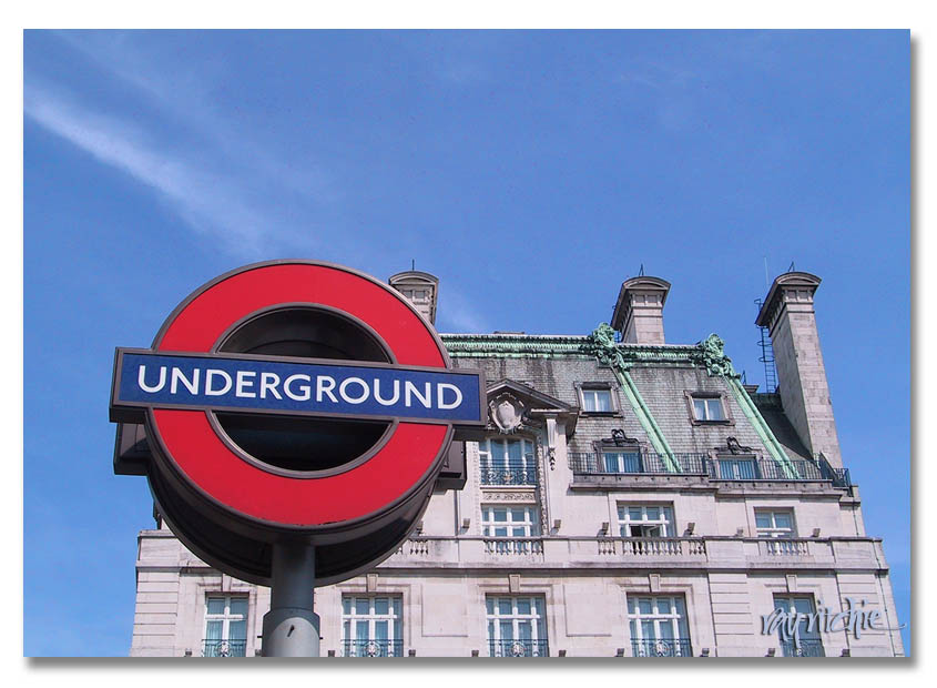
Here Gill Sans is used in the recognizable "Underground" sign seen in London and Futura is used in the iconic brand Louis Vuitton:

I hope that throughout the school year, I have the chance to learn more than what I already know, as I was slightly confused about the history of typefaces and graphic design. If it is possible I would also love to have the chance to improve my Photoshop skills.
Hi Bernice, I wasn't able to comment on your blog last week (sorry!) but it's great to know you took a graphic design course and that you studied different typefaces, photoshop, and about designers and design movement (the Bauhaus). We won't be using photoshop in this course but this program called Gimp. It's free and you can download it at home to use.
ReplyDeleteBernice I had no idea that you took a Graphic Design course, that's really cool! I also like the fact that you take inspiration from Coco Chanel :)
ReplyDelete