Tuesday, November 26, 2013
Summary of My Logo Design
Diverse Dance Team
The Diverse Dance Team is a unique dance team in our school which focuses on different styles of dance ranging from hip hop to kpop. The goal of this team is to have members express themselves freely, gain confidence, and develop better team working skills. The team requires no previous experience as its founders teach the members the dance moves and wants the members to feel more comfortable with the dances. The dance team is also special as it is so diverse in its members and the dances which they learn. Anyone who is looking to join the team is more than welcomed to become a part of it.
Sunday, November 17, 2013
Typefaces
Well, this weekend I went out at night and I had some trouble as it
was too dark for the signs to appear in my images, but I did manage to
find some stuff in a store and some items which I bought.
 While in a supply store I saw these hanging and I found it really interesting that all of those signs which we see just about everyday are all sans serif and capitalized as well. I realized that most of the street signs which we see around the city are also the same, they are all also sans serif and capitalized as well. However, some of the signs are not all capitalized which is interesting because someone had told me that when words are all capitalized, it is harder to read than words that are lower case.
 On Sunday, I was juicing and I when I looked at the bottle, I noticed the name of the company was written in script and I thought it was nice, trying to make the bottle appear more appealing and pretty to the person who is drinking it. I noticed besides that, the bottles are in sans serif and all lowercase. The words at the top before listing the ingredients are in bold and are larger than the ingredients which are listed. All the way at the bottom, the typeface is still the same, however this time, it is smaller. I realized that on packaging, certain words are smaller, but I'm not really sure why or is there really a reasoning behind this.

I couldn't get an exact picture of Pearl Paint as it was dark when I was out, but I realized that its a decorative typeface. I find this really appropriate and interesting as it as an art store. This typeface really fits the mood and really shows the viewer that it is an art store. If the sign were in serif and oldstyle, it wouldn't have really fit for the sign.
Although I didn't really get a chance to take photos outside, I realized that many signs usually use sans serif. I think maybe sans serif is more modern, maybe a bit more casual and friendly than serif, or it's just a way of advertising and trying to get in costumers. Either way, I think typefaces are a big part of our everyday lives and usually many people don't see that until they learn about it. It took me a while to really start paying attention to signs and its typefaces and now I really notice that I have started to pay more attention to it.

 On Sunday, I was juicing and I when I looked at the bottle, I noticed the name of the company was written in script and I thought it was nice, trying to make the bottle appear more appealing and pretty to the person who is drinking it. I noticed besides that, the bottles are in sans serif and all lowercase. The words at the top before listing the ingredients are in bold and are larger than the ingredients which are listed. All the way at the bottom, the typeface is still the same, however this time, it is smaller. I realized that on packaging, certain words are smaller, but I'm not really sure why or is there really a reasoning behind this.
I couldn't get an exact picture of Pearl Paint as it was dark when I was out, but I realized that its a decorative typeface. I find this really appropriate and interesting as it as an art store. This typeface really fits the mood and really shows the viewer that it is an art store. If the sign were in serif and oldstyle, it wouldn't have really fit for the sign.
Although I didn't really get a chance to take photos outside, I realized that many signs usually use sans serif. I think maybe sans serif is more modern, maybe a bit more casual and friendly than serif, or it's just a way of advertising and trying to get in costumers. Either way, I think typefaces are a big part of our everyday lives and usually many people don't see that until they learn about it. It took me a while to really start paying attention to signs and its typefaces and now I really notice that I have started to pay more attention to it.
Tuesday, November 12, 2013
My Edited Photo

In this image I created on Gimp, I put Niall Horan jumping at one of his concerts onto a background of a beach which I took over the summer.
Sunday, November 3, 2013
Letter to Symbol Reflection
While using Gimp, what was most frustrating aspect of the program and/or
project? (Ex. Gimp Tools, translating sketch to design, creating transitional
layers, etc.)
I think the most frustrating part for me was learning to use the program and all of its functions. I don't have much experience with Gimp and because of this, it took me a while to really get to what I was trying to make. Another aspect I found frustrating was trying to really create what I drew on my post its onto Gimp because I tried to make it as detailed and as perfect as I could without really noticing how much time I had to finish it. Due to this I started to rush myself a bit towards the end creating some images that aren't as great as they could have been. At one point, I also found myself wanting to change my idea as I thought it was nearly impossible to create what I had in mind on Gimp, but I decided not to, as I realized I didn't have enough time to change it, so I continued and finished with what I started with.
After completing the project, which Gimp tools do you feel most confident in using? Explain why.
I would say that I am pretty confident in using the path tool. This is because I used the path tool for all of my images to create the curves needed. I wouldn't say that I am perfect at it, but I do know how to use it pretty well, such as clicking on the end to change the size or shape, moving the curves around the page, and dragging it onto the other side of the paper to create a symmetrical image of what I originally created with it. I know that there are many more things that can be done with it, but as of right now I do not know them, but I would say I have a good idea of how I should be using it.
Which Gimp Tool do you wish you were better
at using? Explain why.
I have no specific tool which I wish I am better at using as I haven't gone through all of the tools on Gimp yet. But, I do hope that I get to test it around and play with it more so that I know which tools I can improve on for next time.
However, the layers on Gimp confuses me and I would like to learn how that really works as I find it really different from when I used Photoshop.
What would you
like to create with Gimp next?
*If you do not like Gimp then asnwer the following: What kind of projects/artwork will Gimp be most useful? Explain why.
I would like to know how to add in other photos or images onto a background which I already have. I'm not sure if it is part of the layers, but if so, I would like to learn how to do it.
Friday, November 1, 2013

Tuesday, October 29, 2013
GIF
The following is a GIF which I created with my friend. He is absolutely terrified of the doll shown below.

Monday, October 7, 2013
Reflection
1.Describe the process when creating your name design project. How was the process helpful or not so helpful for you?
I actually struggled with this project, mostly because I find it hard to show people who I am just by creating and designing my name. Maybe it's just me, but I found it really difficult for me. I found the process pretty helpful as it guided me on how and what I should do to get to my final result. I would draft something, later make some adjustments to it, so it could start to show or tell a person something about me.
2.How does your name design represent you? What components did you use to visually tell the viewer about yourself? (Composition, font style, images, symbols, colors, etc)
I believe that my name design tells people my favorite color is blue (which it is) and that I am calm for the most part. I think it can also represent how I am very simple, as I didn't put my name at an angle or add too much design to it. I like to have something right in front me that doesn't require much time to decipher or understand what the message is. The shadows behind my letters also means that although I may appear quiet and simple, I can be very deep and have much to say.
3. How did you create a focal point or emphasis in your design?
I originally intended to make the "N" my focal point as it was larger than the other letters. I made this "N" much larger and it happened to be in the middle of my page, which make it stand out. However, some people think the bottom part of the "R" is the focal point as it stretches out along the rest of my name, but I wanted the "N" to be my focal point.
4.What was the most difficult part of this project for you? Why?
The most difficult part as I said was trying to get across the message of who I am to the viewers. I found it difficult as I felt I couldn't really express who I am through my name. Maybe I'm just not that creative with this project, or there was no way or idea I had in my mind to let others know who I am.
5. Are you satisfied with your project? Explain your answer.
I actually am pretty satisfied with my project. I worked really hard on it and I'm happy with what I have, even though it was not something I wanted in the beginning. What I really enjoy about my final product is how my name appears to be glowing on the paper due to the shadows of the black and blue behind my name, giving it this glowing appearance.
6.If you can change anything about your design, what would you change or do differently?
I would fix the smudges and areas that are darker on my paper because it really frustrates me that they are there and it can draw people's attentions towards that rather than my name. It makes my project seem more unbalanced and due to this.
Tuesday, October 1, 2013
Inspiration
Honestly, I feel as though I do not have much inspiration in my life or something I watched or have seen that really blew me away and stuck with me.
However, I play the piano and whenever I watch videos on YouTube of someone playing the piano, it inspires me to practice harder and spend more time on the piano so that I can hopefully play like that person.
Here's One of My Favorite Pianists on YouTube
Another person who I admire and look up to but am not necessarily inspired by is Coco Chanel. I know this sounds silly, but when I learned about her history, I started to realize that she is pretty inspirational. She was sent to an orphanage at a young age, later working to establish herself in the fashion world, creating timeless pieces, and changing women's fashions. I find her extremely brave as she was constantly criticized with her designs, but she never let them put her down and continued to work on her fashion.
I learned from her that if you work hard, not letting others put you down, you can achieve what you want and even make a change to the world.
Wednesday, September 25, 2013
First Post
Over the summer, I took an Introduction to Graphic Design and Digital Tools course at
Fordham University. I found this topic extremely interesting as I
learned that graphic design is not just simply Photoshop, but it also
focuses on typefaces, fonts, different designers and what they've accomplished, and the Bauhaus movement. All
of this was interesting and after learning about typefaces, I started
to pay more attention to the styles of the words, especially signs on
the streets. Due to this, I feel as though the course opened my eyes on
the world around me and that others, especially students and teenagers
should feel the same way.
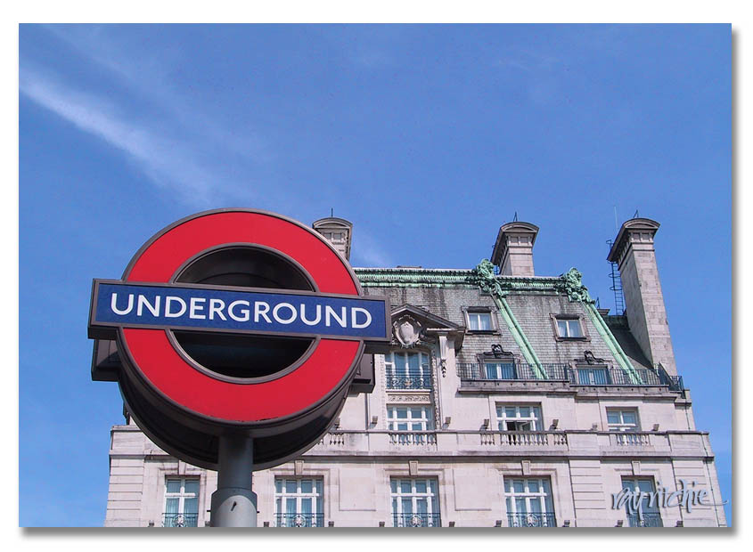
I usually prefer sans serif over serif as I find it more creative and more interesting than serif such as Times New Roman and Century Old style which look strikingly identical to each other but are not. Over the summer, I had to research and discuss about three fonts. I discovered that I really enjoyed Gill Sans and Futura. I am in debate over which one I prefer more.
Here Gill Sans is used in the recognizable "Underground" sign seen in London and Futura is used in the iconic brand Louis Vuitton:

I hope that throughout the school year, I have the chance to learn more than what I already know, as I was slightly confused about the history of typefaces and graphic design. If it is possible I would also love to have the chance to improve my Photoshop skills.
I usually prefer sans serif over serif as I find it more creative and more interesting than serif such as Times New Roman and Century Old style which look strikingly identical to each other but are not. Over the summer, I had to research and discuss about three fonts. I discovered that I really enjoyed Gill Sans and Futura. I am in debate over which one I prefer more.
Here Gill Sans is used in the recognizable "Underground" sign seen in London and Futura is used in the iconic brand Louis Vuitton:
I hope that throughout the school year, I have the chance to learn more than what I already know, as I was slightly confused about the history of typefaces and graphic design. If it is possible I would also love to have the chance to improve my Photoshop skills.
Subscribe to:
Comments (Atom)